Design of Experiments
Contents
DOE Study Editor Interface
User Interface Flow
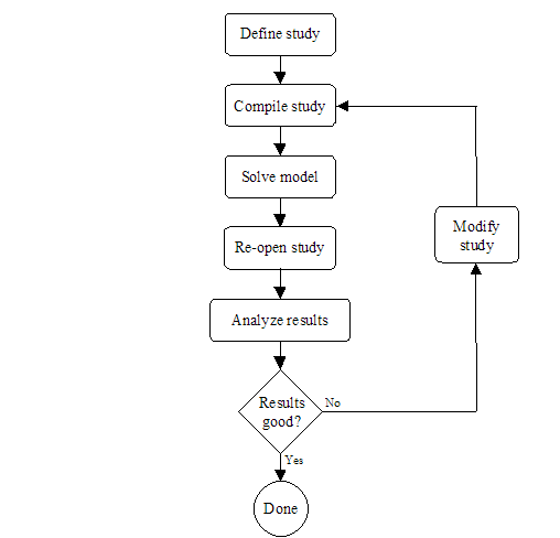
Section 1 presented the modeling flow in Möbius. The first steps in the modeling process are the definitions of the atomic, composed, and reward models. It is at these three modeling levels that all global variables are defined, but not assigned values. The study level is where global variables are assigned values. <xr id="fig:doe_flow_of_model_s" /> shows the modeling flow from the study level onward for a DOE study. During the study definition, all global variables are assigned values for each experiment. After a study is defined, it is saved and compiled into object code, which is later linked in by the solver during the model solution step. After all experiments are complete, the DOE study is reopened, and the results from the experiments are analyzed. If necessary, the study can be modified, and new experiments can be performed. This iterative process continues until the desired results are achieved. The remainder of this chapter will present the details of the graphical user interface of the DOE study editor.
<figure id="fig:doe_flow_of_model_s">
Defining a DOE Study
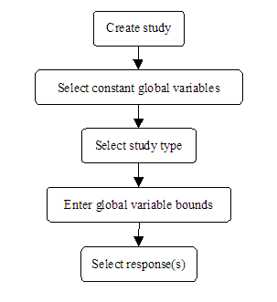
<xr id="fig:doe_flow_of_model_s" /> shows that the first step of the DOE experimentation process is to define a DOE study. There are several steps in the study definition process. <xr id="fig:doe_the_flow_of_eve" /> presents the flow of events involved in defining a DOE study. The remainder of this section will present the details of each step of the DOE study definition.
<figure id="fig:doe_the_flow_of_eve">
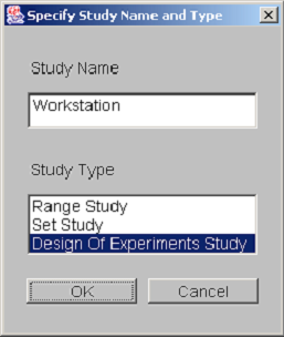
The creation of a new DOE study is similar to the creation of any new model in Möbius. First, from the Möbius project window, select the type of module. Select the study node by clicking on the tree node named “Study” and then press the New button. A dialog asking for the study name and type is presented. <xr id="fig:doe_study_creat" /> shows a dialog from the creation of a study named “Workstation” of type “Design of Experiments Study.” After pushing the OK button, select the reward model upon which the study will be based. After selecting the appropriate reward model and pushing OK, you will be presented with the Constant Global Variable Selection dialog.
<figure id="fig:doe_study_creat">
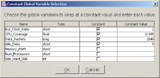
The purpose of the Constant Global Variable Selection dialog is to help users select which global variables are to be held at constant values throughout the study. There are several reasons why some global variables would remain fixed to specific values during a study. One reason is that the variation of some model parameters may be relevant to another study, but not to the current one. Another reason to fix global variables to constant values is that a previous DOE study may have revealed that the variables do not significantly affect the reward model under study, so can be fixed to convenient values. Alternatively, the optimal values of some global variables may already have been determined from earlier studies. In that case, the global variables can be fixed to their optimal values. Any global variables that are held constant will not be included in the empirical model of the response created by the DOE analysis.
<xr id="fig:doe_constant_global" /> shows a Constant Global Variable Selection dialog with a list of all global variable names and types defined in the underlying model. To designate a global variable as constant, its checkbox in the Constant column must be selected by a single mouse click. Once that box has been selected, the value can be entered into the corresponding row under the Constant Value column. There are two ways to enter values into a table in the DOE study editor. One is to single-click the table cell and simply start typing the value. The other is to double-click the table cell. A blinking caret will appear, and all text will be left-justified while you are typing. Regardless of which method is used, pushing the  key will commit the new values to the table. After being entered, all numbers will be right-justified in their table cells. When all of the constant global variables have been selected, push the OK button to proceed to the next step. At any point during the study definition process, you may push the Cancel button in order to cancel the study definition process. After pushing the Cancel button, you will be asked whether the study is to be saved. If it is, it can be reopened later, and the definition process can resume. If you choose not to save the study, then it will be permanently discarded.
<figure id="fig:doe_constant_global">
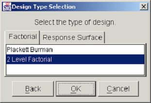
The next step in the DOE study definition is the selection of the design type. <xr id="fig:doe_design_type_sel" /> shows the Design Type Selection dialog. The two categories of designs, factorial and response surface, are presented in separate tab panels. Selecting the Factorial tab shows a list from which either a Plackett-Burman or a two-level factorial design may be selected. Selecting the Response Surface tab displays a list with a choice of either a Central Composite or a Box-Behnken design. After selecting the desired design type from the appropriate list, you may either proceed to the next step by pushing the OK button, or return to the previous dialog by pushing the Back button. At any point in the study definition process, you may move forward or backward to any step and make changes to the study.
<figure id="fig:doe_design_type_sel">
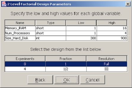
After you have selected the design type, a dialog will prompt you to enter parameters for the chosen design. All design types require that both lower and upper bounds be specified for each nonconstant global variable. In factorial designs, global variables are varied over exactly two values. The values are equal to the low and high values entered in the design parameters dialog. <xr id="fig:doe_design_paramete" /> shows an example 2-Level Factorial Design Parameters dialog. The top table lists each nonconstant global variable name and type. A low and high bound must be entered for each variable. In two-level factorial and central composite designs, a second table displays a list of the different designs that are available. You should select the design that best suits the available computing resources. A single mouse click will highlight the row of the selected design. In <xr id="fig:doe_design_paramete" />, the full resolution design is selected. After all global variable bounds have been entered and the design fraction is selected, the study definition may proceed to the response selection step.
<figure id="fig:doe_design_paramete">
A reward model may consist of several reward variables. Each of the reward variables can be solved using a variety of solution methods available in Möbius. For example, the mean and variance of a reward variable measuring workstation performance may be calculated by a simulation or via several numerical solution methods. The solution from each solver can be represented by a unique response. Each response can be analyzed separately, allowing for the comparison of different solution methods on the same reward variable.
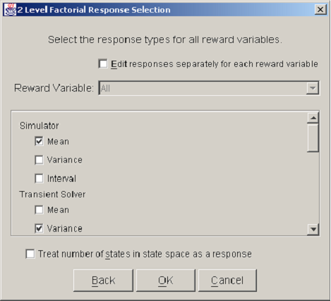
<xr id="fig:doe_response_select" /> shows a Response Selection dialog. A checkbox near the top, labeled Edit responses separately for each reward variable, allows a different set of solution methods to be used for each reward variable. Usually, this checkbox is not selected, and all reward variables are solved using the same solution methods. A scrolling panel in the middle of the dialog lists all of the solver types available in Möbius. The user selects the desired solution methods by clicking the checkbox to the left of each solver name. At the bottom of the dialog window is a checkbox for selecting as a response the number of states in the state space. The purpose of the Response Selection dialog is to allow quick selection of a potentially large number of responses during an initial study definition. If desired, new responses can be added and existing responses deleted after the study definition process is complete.
<figure id="fig:doe_response_select">
DOE Study Editor Window
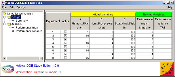
After a study is defined, the DOE Study Editor window appears. It is the main window and is always present, except during the study definition process. <xr id="fig:doe_study_edito" /> shows an example DOE Study Editor window. The data is from the fictitious workstation model from Sections 1 and 2. The window has four areas. The first is the menu bar at the top. The menu functionality will be discussed later in the chapter. At the bottom is the logo panel, which is similar to the logo panel found in other Möbius modules. The lower central portion of the logo panel contains a status area that occasionally displays messages in red text about the status of an activity.
<figure id="fig:doe_study_edito">
On the left side of the window is the design tree panel. The selected node of the design tree determines what is displayed in the main panel, which is the area directly to the right of the design tree. The design tree panel and main panel are separated by a movable divider. The mouse can be used to drag the divider left and right in order to give more screen area to a particular panel. At the top of the divider, as shown in <xr id="fig:doe_study_edito" />, there are two small triangles. Clicking one of the triangles moves the divider all the way to the edge of the window, causing either the design tree panel or the main panel to be hidden, depending on which triangle was clicked. If a panel is hidden, it can be revealed by a single click anywhere on the divider.
The graphical user interface for the DOE study editor was written using Java Swing classes. The appearance of the GUI varies depending on the operating system being used. The screen shots in this chapter were taken on the Microsoft Windows operating system. The DOE study editor will appear slightly different on other operating systems, such as UNIX or Linux. However, the functionality described in this manual will be consistent across operating systems.
Design Tree
Most of the time spent using the DOE study editor involves analyzing the contents of the main panel. There are five different views available for display in the main panel. Each of the five views corresponds to one of the five different types of nodes in the design tree. Clicking on an unselected design tree node will change the contents of the main panel. This section gives a brief description of each design tree node.
At the top of the design tree is the Notes node. Selecting the Notes node displays an editable text area in the main panel. Any comments entered in the text area will be saved when the study is saved. The text area supports cut, copy, paste, undo, and redo functionality, either from the Edit menu or by keyboard shortcuts. Cut, copy, paste, undo, and redo are performed by hitting  Ctrl
Ctrl -
- x
x ,
,  Ctrl
Ctrl -
- c
c ,
,  Ctrl
Ctrl -
- v
v ,
,  Ctrl
Ctrl -
- z
z , and
, and  Ctrl
Ctrl -
- Shift
Shift -
- z
z , respectively.
Below the Notes node is the Design node, which, when selected, displays the design panel in the main panel. The design panel presents all input data for the study, including all global variable and response values for each experiment. The design panel will be discussed in Section 9.6.
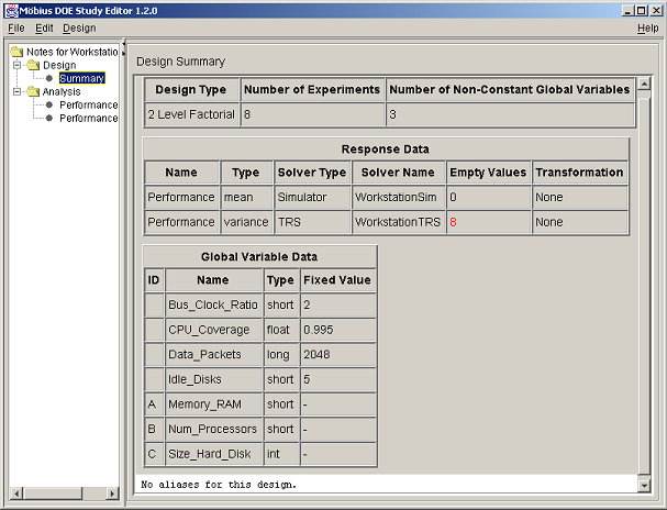
Selecting the Summary node displays a design summary, an example of which is shown in <xr id="fig:doe_summary_panel" />. Response and global variable data are summarized in HTML-formatted tables. If the design is a two-level factorial type with less than full resolution, the alias structure is presented at the bottom of the summary panel. The text from the summary panel can be exported to a file using the Design menu’s Export Text menu item. Further details of all menu items will be offered in the next section.
<figure id="fig:doe_summary_panel">
The Analysis node contains a brief summary of the analysis procedure. Each response in the design panel has a corresponding tree node under the Analysis node. Response analysis requires several steps. Most of the functionality of the DOE study editor is used during response analysis. Before any analysis can be performed on a particular response, the user must enter response values for all experiments into the design panel. Details on how to do so will be presented in Section 9.6.
Menus
There are four menus in the DOE study editor. The first is the File menu, which performs the same functions as the File menus in other Möbius editors. The Save item saves any changes to the study to disk and compiles the global variable values for each experiment into object code. A dialog appears that shows the progress of the compilation and linking process. The object code will be linked in by the solver during model solution. The Document menu item saves an HTML description of the study in the study directory. The Close menu item closes the DOE study. If any changes were made, you will be prompted to decide whether the changes should be saved.
The Edit menu provides basic cut, copy, and paste functionality in any editable text area or text field. Undo and redo functionality are also available, but only in the notes panel, as discussed earlier. Keyboard shortcuts are available for all menu items.
The Design menu contains items specific to the DOE study editor. The Export Regression Model menu item is only enabled when an appropriate analysis panel is displayed. The uses of exporting the regression model will be discussed in Section 8.8.2.
The Export Text menu item is used to save any displayed panel to a text or HTML-formatted file. If the notes or design panel are displayed, the contents of the panel will be saved to a text file. If the summary panel is displayed, the contents of the panel will be saved to an HTML file. Other uses of the Export Text menu item will be presented later.
The Redefine Design menu item is used to initiate the study definition process explained in Section 8.2. A user might wish to redefine a study to correct a mistake made during the initial study definition. He or she could also use redefinition to augment the design. Design augmentation involves adding more experiments to a study so that more information can be gained about the responses under study. For example, a half-fraction two-level factorial design may not present enough information for the user to build an accurate empirical model of the response. The design can be augmented with the other half-fraction in order to create the full-resolution design, doubling the number of experiments in the study. However, half of the experiments will already have been completed. After the remaining half are run, an analysis of the full resolution 2k design can be performed. One caveat of design redefinition is that all data in the response columns in the design panel are erased when a study is redefined. In order to restore the data, the user must re-query the results database to fill in the response columns. Instructions for gathering response data from the results database will be presented in the next section.
The Hide/Show Logo Panel menu item is useful for gaining valuable screen area. On small screens, it may be difficult to view some of the graphs in the analysis panels. Hiding the logo panel can increase the area available for viewing such graphs. That can reduce the amount of scrolling necessary in viewing the data. One disadvantage of hiding the logo panel is that the status bar will not be visible; furthermore, any important messages displayed there would also not be visible.
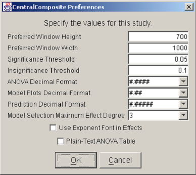
The last item in the Design menu displays a list of preferences for the current study. <xr id="fig:doe_preferences_dia" /> shows an example Preferences dialog. The first two items allow the user to specify the preferred window dimensions. Once the preferred height and width have been entered and the study has been saved, the DOE Study Editor window will reopen with the specified window dimensions. This feature allows users to customize the window size to suit a particular large or small screen. The remaining preference items are specific to the analysis procedure and will be discussed later. It is important to note that saved preferences are relevant only to a specific study, not to all DOE studies.
<figure id="fig:doe_preferences_dia">
The last menu is the Help menu on the right side of the menu bar. The About item displays information about copyrights and contact information for the PERFORM research group. The Reward Info item displays the name of the reward model on which the study is based.
Design Panel
Whenever a DOE study is opened, the first view displayed in the main panel is the design panel. The design panel displays the entire experimental design in the design table. <xr id="fig:doe_design_table" /> shows an example design table. Each row represents an experiment. The global variable columns represent the factor values. The reward variable columns represent the responses. The Active column displays the experiments that will be performed by the solver, and replaces the Experiment Activator found in the Set and Range study editors. If a checkbox is selected, then the experiment for the corresponding row is active.
<figure id="fig:doe_design_table">
You can activate several pop-up menus by right-clicking on certain column headers of the design table. The Active column has a pop-up menu with four choices for experiment activation. All experiments can be either activated or deactivated with a single menu choice. Alternatively, experiments from only the selected rows can be activated or deactivated. Row selection is performed by left-clicking on a row with the mouse. The  and
and  keys can be used with the mouse click to select a sequence or noncontiguous block of rows, respectively.
For response surface designs, a pop-up menu is available on the Experiment column header. The user may add experiments to the bottom of the table. Any user-added experiments may be removed from the table via the Remove Selected item on the Experiment column’s pop-up menu. Only user-added experiments may be removed from the design table; the built-in design must remain intact. The ability to add experiments to factorial designs is not enabled. The factorial designs built into Möbius are orthogonal. Adding arbitrary experiments would destroy the orthogonality and distort the analysis. Response surface designs do not require orthogonality for analysis. You should avoid creating arbitrary experiments that are far from the design space of the original built-in design. Points far from the original design center can grossly distort the response surface, resulting in inaccurate prediction. For the same orthogonality reason, global variable values cannot be edited in the design table for factorial designs. They can, however, be edited in response surface designs. Again, you are cautioned against entering factor levels that produce design points far from the original design.
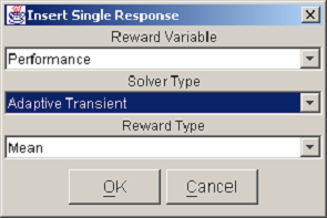
You can activate the response pop-up menu by right-clicking on any reward variable column header. The Insert Response item allows you to add a single response column to the table. The dialog in <xr id="fig:doe_response_insert" /> appears, prompting you to select the reward variable, the solver type, and the reward type. Pushing the OK button in the example shown in <xr id="fig:doe_response_insert" /> would add a new response measuring the mean performance using the adaptive transient solver. The Delete Response item removes a response column from the table. There must be at least one response, so the last response cannot be deleted.
<figure id="fig:doe_response_insert">
There are three menu items in the response pop-up menu associated with filling the column with data. One item, which is very useful for experimenting with the DOE study interface, is the Fill With Random item. Selecting that menu item will fill the response column with uniformly distributed integers between 90 and 110. No analysis of a response can take place until the entire response column is filled with data. Therefore, the Fill With Random feature is a quick way to start playing with the analysis tools, which will be described later. To analyze real data, you must fill the response columns with solver data by querying the results database for the model solutions.
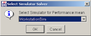
There are two pop-up menu items for filling a response column with data from the results database. The Fill Selected item fills in data only for the selected rows in the design table. The Fill Column item fills the entire column with the solved reward variable results. Selecting either of the two choices causes a dialog similar to the one in <xr id="fig:doe_solver_selectio" /> to appear. Because the column associated with the pop-up menu represents data from a simulator, the dialog in <xr id="fig:doe_solver_selectio" /> will prompt you to select from a list of simulators defined in the project. Once the solver has been selected, the results database will be queried, and the response values will be retrieved and placed into the response column.
<figure id="fig:doe_solver_selectio">
To erase values from a response column, the Clear Selected or Clear Column pop-up menu items can be selected. The Clear Selected item clears the response values only for the selected rows in the table. The Clear Column item erases the entire column. The user may also edit the response values by typing the values directly into the table cells. Only after every response value in a column has been entered may analysis of the response be performed.
Analysis Procedure
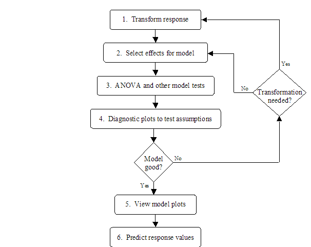
For every response column in the design table, there is a corresponding node under the Analysis node in the design tree. After all response values have been filled in for a particular response column, the corresponding tree node can be activated. Clicking on the response node reveals the analysis tabs in the main panel. There is a sequence of six tabs that, when clicked, reveal a panel for performing one step in the analysis procedure. The user interface for the tab panels will be presented in the remainder of the chapter. <xr id="fig:doe_analysis_flow_i" /> shows the analysis flow corresponding to the six tab panels. In summary, the goal is to build and evaluate a regression model of the response and to use the regression model to predict response values at points in the design space other than the experimental points. Steps 1 and 2 transform the observed response values (if necessary) and build a regression model from the significant effects. Steps 3 and 4 analyze the model for significance and test the assumptions made on the data. If the model is good, then it can be used to produce graphs of the response and predict new values in the design space, as indicated in steps 5 and 6 of <xr id="fig:doe_analysis_flow_i" />. The six tabs are shown along the top of <xr id="fig:doe_six_tab_panels_" />. They progress from left to right as the analysis progresses.
<figure id="fig:doe_analysis_flow_i">
<figure id="fig:doe_six_tab_panels_">
The first step in the analysis procedure allows the user to transform the observed response values. After a transformation is applied, all analysis is done on data that are some function of the original solver values. There are three situations in which a transformation may be required. The first occurs when the maximum-to-minimum ratio of the response values is large. The second occurs when a priori knowledge of the system results in the belief that a particular function of the response, rather than the response itself, is better suited to a regression model. Both of those situations require that the transformations take place before any analysis is performed. It is for that reason that the Transformation tab is placed first in the analysis flow.
The third situation in which a transformation is required occurs after an initial analysis has revealed that the assumptions on the response data have been violated. For example, a nonconstant variance might not be discovered until the Diagnostic Plots phase of the analysis. The user must then backtrack to the Transformation tab, build a new regression model, and re-analyze the data. It is very common to move backward and forward while experimenting with different model parameters. The interface allows the user to click on a previous tab at any time to try out new settings. Regression model analysis is often trial-and-error because the underlying model of the response behavior is unknown. The whole point of experimental design is to allow better understanding of the structure of the response.
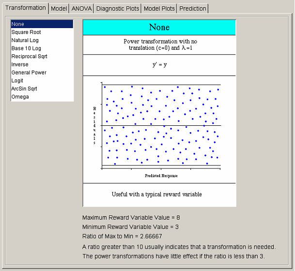
<xr id="fig:doe_six_tab_panels_" /> shows the list of available transformations on the left side of the transformation panel. Selecting any transformation changes the graphic to the right of the transformation list. The first seven transformations belong to the power family. The graphic for each power transformation contains a sample of what the Residuals vs. Predicted Response plot should look like if the selected power transformation is applicable. All graphics contain information about when the selected transformation is most useful. Most transformations have restrictions on the input data, which are illustrated in each transformation’s graphic. Many transformations have optional parameters that can be entered in the text fields that appear below the transformation list when appropriate. The most common parameter is the translation constant c. Adding the appropriate constant to each reward variable will translate the values to a range for which the selected transformation is valid. If the selected transformation is invalid for any response values, a dialog will warn about the offending values when the user tries to progress to the next analysis step. The ratio of maximum-to-minimum response values is presented below each graphic to aid in the decision on whether a transformation is necessary.
Most commonly, no transformation is applied to the response. The remaining analysis steps are identical regardless of whether the response has been transformed. If you do use a transformation, it is important for you to remember that regression model plots and prediction are presented in the transformed domain. Whenever possible, the response is labeled wrapped in the corresponding transformation function. For example, if the natural logarithm transformation is used, the response will be labeled “Ln[response_name].”
Model Selection
After the appropriate transformation has been selected, the next step is to click on the Model tab and choose the effects to include in the regression model. The method for choosing effects varies depending on whether a factorial or a response surface design is being analyzed. Each case will be presented separately.
Factorial model selection
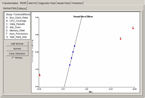
For factorial designs, one may select effects either graphically or from a table. Each selection interface has a separate tab panel within the model panel. The Normal Plots tab shows the normal quantile plot of effects. <xr id="fig:doe_normal_plot_of_" /> shows an example normal plot of effects. If the effects follow a normal distribution, then the normal quantile plot of ordered effects will follow a straight line. The outliers are the significant effects. On the normal plot of effects, outliers appear at the top and bottom of the plot. <xr id="fig:doe_normal_plot_of_" /> shows three outliers: two at the top and one at the bottom. To select an effect for inclusion in the regression model, the user simply clicks the point corresponding to the effect. The selected points will turn from blue to red, and the label of the chosen effect will be placed near the selected point. An ordinary least squares straight line will be drawn through all unselected blue points.
<figure id="fig:doe_normal_plot_of_">
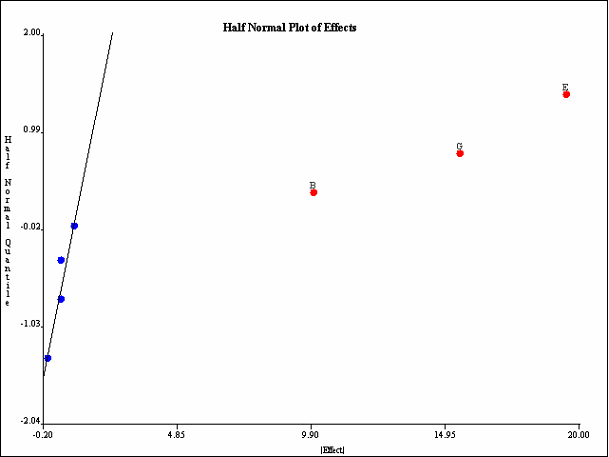
The most common graphical method for selecting effects is the half-normal plot. The half-normal plot is identical to the normal plot, but the absolute values of the effects are plotted. All outliers appear in the top right section of the plot. <xr id="fig:doe_half_normal_eff" /> shows the same data as <xr id="fig:doe_normal_plot_of_" />, but plotted on a half-normal quantile plot. All three outliers (largest effects) are selected at the top right of the plot. In this example, main effects B, E, and G are included in the regression model.
<figure id="fig:doe_half_normal_eff">
You may switch back and forth from normal to half-normal views of the effects plots by selecting the appropriate button under the factor list at the left side of the normal plots panel. You can unselect all selected points by pressing the Clear Selection button. The Fill Points checkbox controls whether the plotted points are filled-in colored disks, or simply hollow circles. Deselecting the checkbox can make point labels easier to read on a very crowded plot.
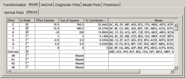
The user can also select effects via the table in the Effects tab panel. <xr id="fig:doe_factorial_effec" /> shows the effects table corresponding to the data in the normal plots in <xr id="fig:doe_normal_plot_of_" /> and <xr id="fig:doe_half_normal_eff" />. Only the portion of the table listing the nonaliased effects is shown, in order to conserve space. The first column lists all effects up to five factor interactions. You can include in the regression model any effect that is not aliased by clicking on the corresponding checkbox in the In Model column. The next two columns list the effect estimate and sum of squares value for each effect. If an effect is aliased, the word “aliased” appears instead of a sum of squares value. The % Contribution column lists the percentage that the corresponding effect’s sum of squares contributes to the total sum of squares. The elements of the % Contribution column will always add to 100%, except in Plackett-Burman designs in which interactions contribute a nonzero sum of squares. Only main effects are listed for Plackett-Burman designs. The last column lists the aliases of the effects in the first column. Only aliases for up to five factor interactions are listed. A complete list of the alias structure can be found in the Summary tree node.
<figure id="fig:doe_factorial_effec">
Each column in the effects table is sortable. Clicking on any column header will sort the list in descending order. Clicking again will sort in ascending order. The standard procedure is to click on the % Contribution column header to bring the effects that explain the most observed variability of the response to the top of the column. Effects with larger percent contributions are more likely to be significant regression model terms. <xr id="fig:doe_factorial_effec" /> shows that the top three effects, E, G, and B, are selected for inclusion in the regression model. Those effects were also selected in the normal plots in <xr id="fig:doe_normal_plot_of_" /> and <xr id="fig:doe_half_normal_eff" />. Selecting an effect from the effects table is equivalent to selecting the same effect from the normal plot.
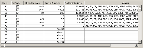
The effects table in <xr id="fig:doe_factorial_effec" /> shows that effects E and G explain 52.7% and 33.3% of the observed variability of the response. Suppose that experience with the system being modeled indicates that the interaction EG should exert a strong effect on the response. Suppose also that factor B is not expected to be influential on the response. However, according to the effects table, B explains 13.9% of the observed variability. Careful inspection of the aliases for effect B reveals that B is aliased to EG (and several other interactions). This observation would lead the experimenter to conclude that the 13.9% variability is due to interaction EG, not factor B. Inclusion of factor B in the regression model would lead to invalid conclusions. Fortunately, there is a way to alter the alias arrangement in the effects table so that the correct effect can be added to the regression model.
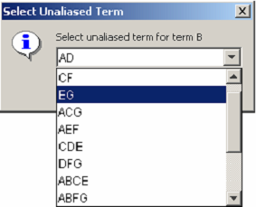
Right-clicking on any row of the Effect or Aliases column activates a pop-up menu allowing the aliases for the row’s effect to be edited. <xr id="fig:doe_edit_aliases_di" /> shows the dialog that appears after a user has selected the pop-up menu item to edit the aliases for effect B. The pop-up shows a pull-down menu listing the aliases of B. After term EG has been selected, the effects table is updated as shown in <xr id="fig:doe_updated_effects" />. Factors E, G, and their interaction EG will then be used to build the regression model.
<figure id="fig:doe_edit_aliases_di">
<figure id="fig:doe_updated_effects">
Regression models in the DOE study editor are required to be hierarchical. In a hierarchical model, all parent effects for all interactions in the model must also be included in the model. For example, if interaction ABC is included in a regression model, the parent effects A, B, C, AB, AC, and BC must also be included. Möbius automatically includes the terms necessary to make the selected model hierarchical. This automatic update is performed whenever the user switches to a different view in the main panel. Clicking from the Effects tab to the Normal Plots tab will automatically cause all parent effects to be added to the selected regression model.
Response surface model selection
The method of effect selection for response surface designs differs from the factorial method. There is no graphical procedure for selecting effects for response surface designs. Under the Model tab in response surface designs, there are two tabs to choose from: the Fit Summary and Model Selection tabs.
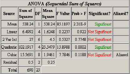
The fit summary panel summarizes the fit of several regression models to the observed response values. An ANOVA table is used to calculate the significance of each model. <xr id="fig:doe_anova_table_in_" /> presents an example ANOVA table for five models. The mean regression model contains only the average response value. If  is the average, then the model is simply
  . The linear model contains the mean and all main effects. The two-variable interaction model contains all effects from the mean and linear models, plus all two-factor interactions. Each successive model adds more terms to the model. The quadratic model adds pure second-degree effects (A2, B2, C2
 ). The cubic model adds all pure cubics (A3, B3, C3
 ), all mixed terms (A2B, A2C, AB2
 ), and all three-factor interactions (ABC). The ANOVA is calculated using the sequential sum of squares method explained in Section 3.5. The Significant column in the ANOVA table tells whether the corresponding model’s additional terms added to the sequential model contribute significantly to the observed variability in the response. From <xr id="fig:doe_anova_table_in_" />, it is clear that the pure quadratic terms contribute significantly to the regression model. The linear and two-variable interaction models are not significant. The response surface must exhibit second-order characteristics, which are best modeled with quadratic regression polynomial terms.
<figure id="fig:doe_anova_table_in_">
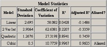
A second table of model statistics presents further information to help users choose appropriate regression models. <xr id="fig:doe_fit_summary_mod" /> lists useful statistics for each of the models presented in the ANOVA table in <xr id="fig:doe_anova_table_in_" />. The Adjusted  column is the most important. The table exhibits the fact that the
  value always increases as terms are added to the regression model, but the adjusted
  can actually decrease. A negative adjusted
  for the linear and two-variable interaction models indicates that they are not adequate models of the response. The quadratic model explains 74.59% of the response’s observed variability, according to the adjusted
  value.
<figure id="fig:doe_fit_summary_mod">
In both example fit summary tables, the cubic model is aliased. The concept of an aliased model in response surface methodology is similar to that in factorial designs. An aliased model is one in which there have not been enough experiments performed to estimate all of the effects in the model. In order to de-alias a response surface model, it is necessary to add more experiments in the design panel, as explained in Section 8.6.
The last piece of information presented in the fit summary panel is the sum of squares details for the ANOVA table. Each effect added to the sequential model has a corresponding sum of squares term. There are two separate sum of squares lists. The first is sorted by effect name; the second is sorted in descending order by sum of squares magnitude. The most influential effects will be placed at the top of the second list. It is important to remember that for a sequential sum of squares, the order in which effects are added to the model may affect the magnitude of the sum of squares. The sorted sum of squares list is useful for selecting potentially highly significant effects for inclusion in the regression model.
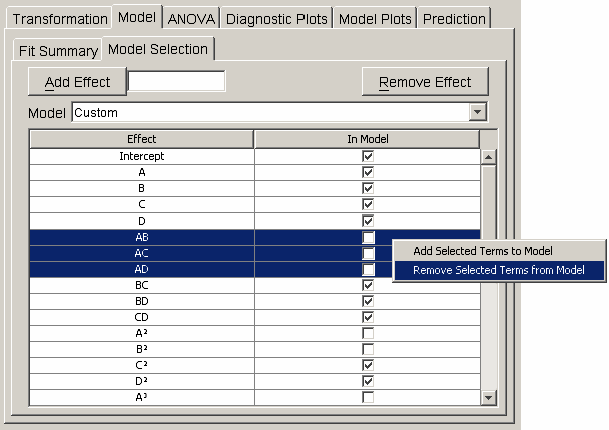
Effects are added to the regression model in the model selection panel. The table in <xr id="fig:doe_model_selection" /> lists each effect in the first column and a corresponding checkbox in the second column. A single mouse click on the checkbox toggles the effect’s inclusion in the model. When any row is selected, the user can activate a pop-up menu by right-clicking anywhere on the table. The pop-up menu, shown in <xr id="fig:doe_model_selection" />, contains items for removing all selected effects from or adding all selected effects to the regression model. An alternative to clicking directly on the table to select effects is to use the Model pull-down menu above the table. From the pull-down menu, the mean, linear, quadratic, cubic, or other model may be selected.
<figure id="fig:doe_model_selection">
By default, the highest-degree effect listed in the model selection panel is three. You can alter this maximum degree by selecting a different maximum degree from the preferences dialog. The choices for the maximum degree are two through six. Another way to add a specific higher-order effect to the table is to type the desired effect in the text field at the top of the Model selection panel and click the Add Effect button. For example, if effect A5B is desired, the user may type any of “A5B”, “a5b”, “A5B”, or “a5B” and push the Add Effect button to place  in the table. All parent effects required to support hierarchy are automatically added to the table. Therefore, adding A5B will automatically add
  ,
,  ,
,  , and
, and  to the table if they are not already there. The maximum degree effect allowed is six. For example,
  ,
,  , and
, and  are all sixth-degree effects. To remove any user-added effects, you can press the Remove Effect button; a dialog will prompt you to select from a list of added effects. The selected effect and all parent effects required for hierarchy are then removed from the table.
By default, no exponents of degree four or higher are displayed in superscript font. If the computer system running the Möbius interface has the superscript fonts installed, then you can activate their display by clicking the Use Exponent Font in Effects checkbox in the preferences dialog. Selecting this option also affects the display of exponents in the fit summary and ANOVA panels.
ANOVA
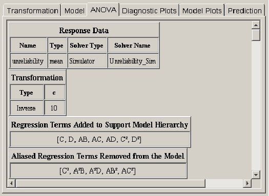
After the effects for the regression model have been selected, a statistical analysis can be performed to evaluate the quality of the model. Clicking on the ANOVA tab reveals a wide variety of statistical output about the regression model. <xr id="fig:doe_initial_data_in" /> shows the first four pieces of information from an example response surface design. The first two items summarize the response and transformation information. The next two items do not always appear. If effects had to be automatically added to the regression model in order to make it hierarchical, then a list of those effects will be presented below the transformation data, as presented in <xr id="fig:doe_initial_data_in" /> . The final piece of data applies only to response surface designs. It is possible in the model selection panel to select more effects than can be independently estimated given the available degrees of freedom. If this happens, some of the selected effects will be aliased to other effects in the model. As effects are sequentially added to the regression model from lower to higher order, any effect that is aliased to an effect already in the model is not actually added to the model. Instead, it is placed in the list of aliased terms presented in the ANOVA panel. The alias structure is dependent on which effects are already in the model. Therefore, the complete alias structure for the selected model is presented in the ANOVA panel after the entire model is selected.
<figure id="fig:doe_initial_data_in">
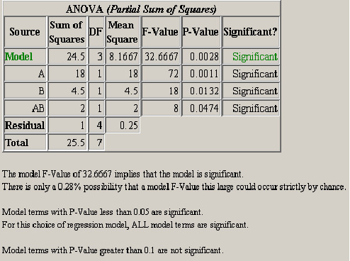
The next item in the ANOVA panel is the analysis of variance table. <xr id="fig:doe_anova_table_wit" /> shows a screen capture of the ANOVA table for a typical Möbius model. The significance of the model and each effect should be analyzed. If an effect is not significant and it is not required to support the model hierarchy, then it should be removed from the model. The significance and insignificance thresholds are defined in the preferences dialog. The default thresholds are 0.05 for significant and 0.1 for insignificant. Any effect with a P-Value less than the significance threshold is significant. Any effect with a P-Value greater than the insignificance threshold is not significant. The significance of an effect with a P-Value between the two thresholds is left to the experimenter to decide.
<figure id="fig:doe_anova_table_wit">
A summary of the ANOVA results is presented after the ANOVA table. The summary in <xr id="fig:doe_anova_table_wit" /> gives an interpretation of the model P-Value. Multiplying the model P-Value by 100 gives the percent possibility that the given significance level could occur strictly by chance. A summary of which terms are significant and not significant is also given.
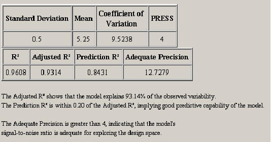
After the ANOVA summary, there are two tables of regression model statistics. The theory behind these statistics was presented in Section 3.6. <xr id="fig:doe_regression_mode" /> shows a sample with a summary of the data below the tables. The adjusted R2 should be as close to one as possible. The model should explain as much variability as possible without insignificant effects. The prediction capability of the regression model is best when the adjusted R2 and prediction R2 are as close to each other as possible. If the two are within 0.20 of one another, then the predictive quality is acceptable.
<figure id="fig:doe_regression_mode">
A table of diagnostic statistics for each experiment is presented next. The data in each column are presented graphically in the Diagnostic Plots panel. The tabular presentation is an alternative to the scatter plots and is preferable for some users. For experiments with leverage values of one, the student’s residuals, Cook’s distance, and outlier t are undefined.
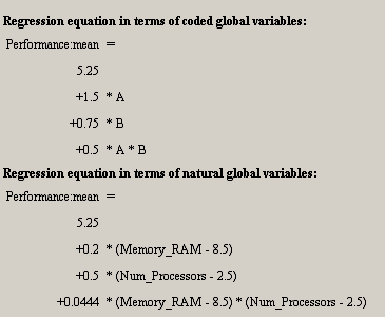
Below the diagnostic statistics table are two representations of the regression model polynomial. <xr id="fig:doe_regression_equa" /> shows both representations. Each polynomial is written with one term per line to facilitate formatting. For example, the first equation in <xr id="fig:doe_regression_equa" /> is

The first equation is presented in coded global variable terms. The coded variables are the natural values scaled from –1 to +1. They are the values used for internal calculations. The equation in terms of natural global variable values is the one used to predict response values. The first item in the Design menu allows the natural form of the regression equation to be exported to a file. The file may be in either plain text or Mathematica notebook format.
<figure id="fig:doe_regression_equa">
The final piece of data presented in the ANOVA panel is a table of standard errors and confidence intervals for each regression model coefficient. <xr id="fig:doe_standard_errors" /> shows an example table. The standard error is the standard deviation of the coefficient estimate. The 95% confidence intervals represent the range in which the coefficients should lie 95% of the time. If the range contains zero, then the coefficient is not significant.
<figure id="fig:doe_standard_errors">
The area of the ANOVA panel containing the table of standard errors is an editable text area. Comments can be entered in the text area. The entire ANOVA panel can be exported to an HTML file using the Design menu’s Export Text item. A plain-text version of the ANOVA table can also be appended to the ANOVA panel output if the appropriate checkbox is selected in the preferences dialog. The plain-text version is useful for copying and pasting text into the notes panel or to another application.
Diagnostic Plots
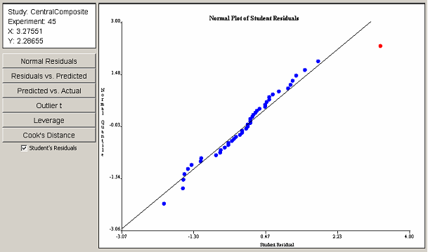
If the regression model produced satisfactory results in the ANOVA panel, the analysis may proceed to the Diagnostic Plots panel. The diagnostic plots consist of six scatter plots of the data from the Diagnostic Statistics table in the ANOVA panel. Six buttons on the left side of the Diagnostic Plots panel control which of the six plots is displayed. <xr id="fig:doe_normal_plot_of_" /> shows the panel with an example normal plot of studentized residuals. Each point in the diagnostic plots can be selected with a single mouse click. An information panel above the buttons gives details about the selected point, such as the coordinates and the corresponding experiment number.
The normal plot of studentized residuals in <xr id="fig:doe_normal_plot_of_stud" /> shows that the response residuals generally follow a straight line throughout the central portion of the plot. Therefore, it can be assumed that the residuals are normally distributed. The outliers at the lower and upper extremes are not sufficient grounds for dismissal of the normality assumption. The outlier in the upper right portion of the plot is selected in red. The information panel reveals that the selected outlier corresponds to experiment 45.
<figure id="fig:doe_normal_plot_of_stud">
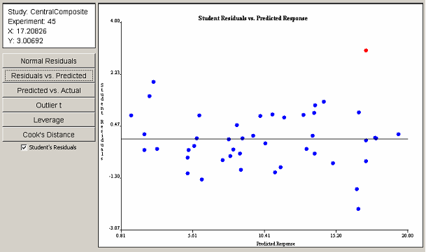
Clicking on the Residuals vs. Predicted button reveals the plot in <xr id="fig:doe_student_residua" />. With the exception of the selected outlier, no visible trend is present. Therefore, the assumption of constant variance of residuals is valid. As in the previous plot, the outlier corresponds to experiment 45. A checkbox below the six plot selection buttons toggles the display of studentized residuals versus ordinary least squares residuals. The studentized form of residuals is preferred. However, in some cases, the studentized residuals are not defined. In those cases, the ordinary residuals must be used to validate the assumptions.
<figure id="fig:doe_student_residua">
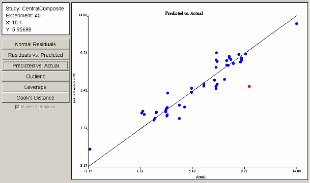
The Predicted vs. Actual plot in <xr id="fig:doe_predicted_vs__a" /> shows that most points are gathered near the 45o line, implying a fairly good least squares fit. The point farthest from the line is selected in red and, again, corresponds to experiment 45. The data gathered from the first three plots indicate that experiment 45 may have a problem.
<figure id="fig:doe_predicted_vs__a">
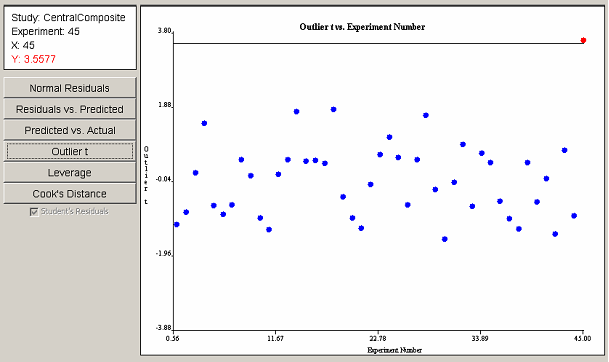
The outlier t plot in <xr id="fig:doe_outlier_t_diagn" /> shows that experiment 45 is indeed an outlier. The information panel indicates in red type that the value of the outlier t for experiment 45 is barely larger than 3.5, making it an outlier. Further investigation by the experimenter would be required in order to either justify or discount the data from the outlying experiment.
<figure id="fig:doe_outlier_t_diagn">
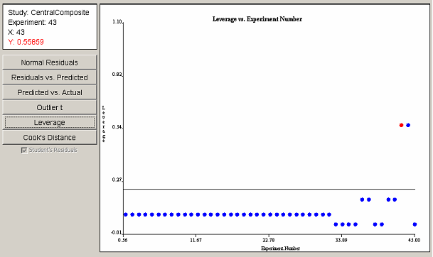
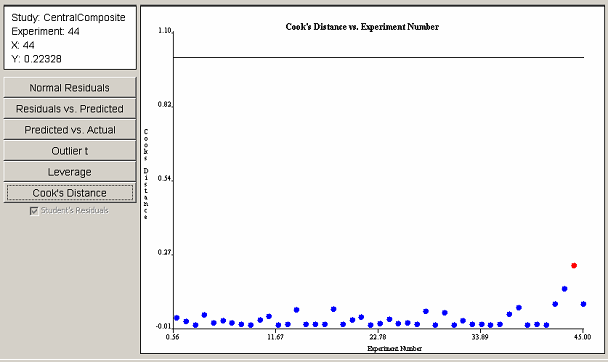
The leverage plot in <xr id="fig:doe_leverage_diagno" /> shows a pair of points with leverage values greater than twice the average leverage value. The two points exert a disproportionately large influence on the model fit. The Cook’s distance plot in <xr id="fig:doe_cook___s_distan" /> does not reveal any evidence of disproportionately large influence among the experimental points. Any points that cross the threshold lines in the leverage or Cook’s distance plots should be investigated.
<figure id="fig:doe_leverage_diagno">
<figure id="fig:doe_cook___s_distan">
If all diagnostic plots look good, then the analysis may proceed to the inspection of the regression model graphs. If any of the diagnostic plots reveal a problem, then the analysis should not proceed to the next step. Instead, transformations, model reduction, or additional experiments should be considered. Conclusions from the Model Plots and Prediction phases of the analysis are valid only if all diagnostic tests show satisfactory results.
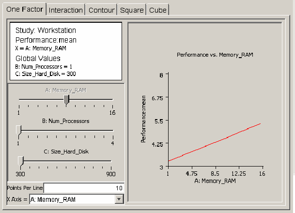
After verifying that the regression model is adequate for prediction, the user can use plots of the regression model to analyze response behavior. There are five different types of plots available in the model plots panel. The user selects the type of plot by clicking on the appropriate tab within the model plots panel. All of the plot panels have the same layout. <xr id="fig:doe_one_factor_mode" /> shows the layout of the one-factor plot panel. The plot occupies the right side of the panel. The left middle portion of the panel contains slider controls for each global variable in the regression model. A slider can be enabled or disabled. If a slider is disabled, it will appear dimmed. In <xr id="fig:doe_one_factor_mode" />, the slider for global variable A:Memory_RAM is disabled, but the other two sliders are enabled. A slider becomes disabled when its corresponding global variable is selected as an axis label. In <xr id="fig:doe_one_factor_mode" />, the horizontal, or x-axis, is labeled as A:Memory_RAM. Axes are selected from pull-down menus at the bottom left corner of the main panel. An information panel above the sliders displays the axes labels and the current values of all factors corresponding to all enabled sliders. In <xr id="fig:doe_one_factor_mode" />, the values for global variables B and C are listed in the information panel at their lowest values of 1 and 300, which correspond to the selected values of each enabled slider. As the sliders are adjusted, the plot and information panels update immediately. This allows for “real time” feedback of response behavior as the global variable values are varied. The decimal format for the numbers in all model plots can be changed in the preferences dialog. The default number format is #.##, which limits the number of digits to the right of the decimal point to two.
<figure id="fig:doe_one_factor_mode">
The first type of model plot is the one-factor plot, presented in <xr id="fig:doe_one_factor_mode" />. The one-factor plot shows how the response behaves as a single global variable is varied from its low to high value. The example plots in this section are from the workstation example presented earlier. <xr id="fig:doe_one_factor_mode" /> shows how workstation performance increases as the amount of RAM is increased from 1 to 16 GB, with 1 processor and 300 GB of hard disk space. The Points Per Line text field below the sliders allows the resolution of the plot to be adjusted. Users draw all plots by drawing straight lines connecting a given number of sample plot points. Increasing the points per line makes the graph smoother. For factorial designs, all one-factor plots will be straight lines, so increasing the points per line does not affect the plot. In response surface regression models, global variables can be quadratic and higher-degree, which can add curvature to the one-factor plot.
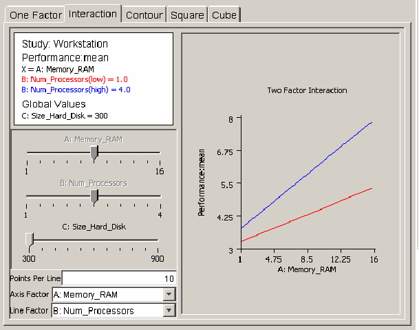
The interaction plot is useful for revealing how regression model global variables act together on a response. <xr id="fig:doe_interaction_mod" /> shows an example interaction plot. Two lines of workstation performance are plotted versus the amount of RAM: one line with one processor, the other with four processors. If the number of processors and the amount of RAM do not affect each other, then the lines will be parallel. However, <xr id="fig:doe_interaction_mod" /> reveals that the lines are not parallel, indicating that an interaction is present between the two global variables. Performance increases more sharply with four processors than with one as the RAM is increased from 1 to 16 GB. You can vary the hard disk size by adjusting its slider to see if it affects the interaction.
<figure id="fig:doe_interaction_mod">
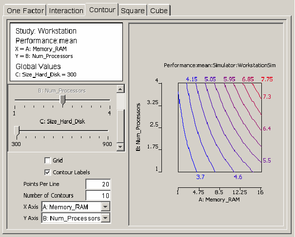
If there are m factors in the regression model, then the response can be represented as a surface in m-space. Any two of the m factors can be selected as the axes for a graph of a two-dimensional projection of the response. The contour plot helps the user visualize the shape of the response using a two-dimensional projection. <xr id="fig:doe_contour_model_p" /> shows a contour plot of workstation performance versus the number of processors and the amount of RAM. Contours mark lines of constant performance. Each contour line is a different color. A label with the same color indicating the value of the response is placed near each contour line. <xr id="fig:doe_contour_model_p" /> shows how performance increases from 3.7 on the left side of the plot to 7.75 at the upper right corner. Checkboxes for toggling the display of the contour labels and the display of a grid are available. The grid size is determined by the number of points per line. The number of contours can be adjusted in the text field above the axes’ pull-down menus.
<figure id="fig:doe_contour_model_p">
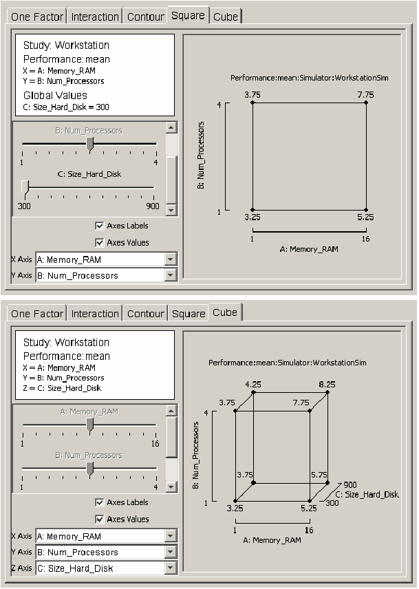
The last two types of plots are useful visuals for revealing how the response varies as two or three global variables vary from their low to high values. The square plot and cube plot in <xr id="fig:doe_square_and_cube" /> show how workstation performance varies as each global variable is varied from one extreme to the other. The cube plot indicates that the size of the hard disk has a much smaller effect on performance than the other two global variables do.
<figure id="fig:doe_square_and_cube">
Prediction
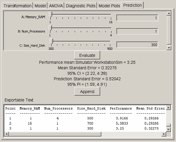
If the model plots show that the regression model is acceptable, the model can be used to predict the response at exact points in the design space. The prediction panel provides a method for selecting a point in the design space and calculating the response value, standard errors, confidence intervals, and prediction intervals for the selected point. <xr id="fig:doe_prediction_pane" /> shows the interface for selecting the prediction point. Each global variable in the regression model is listed at the top of the prediction panel with a corresponding slider control and text field. The values in the text fields represent the coordinates in the design space. You can alter the text field values by adjusting the slider controls from the low to high values. You may also type values directly into each text field. After entering a value in the text field, push the Evaluate button to update the labels for the prediction point data. A text area at the bottom of the prediction panel displays a summary of information about the global variables in the study. Whenever the Append button is pushed, the data for the predicted point are appended to the text area. The text area is editable. The Export Text item in the Design menu allows the entire contents of the text area to be exported to a text file.
<figure id="fig:doe_prediction_pane">
The decimal format can be changed in the preferences dialog. The default format is to display five digits to the right of the decimal point. The confidence levels are based on the significance threshold defined in the preferences dialog. Be cautious about predicting response values that are far from the design center. Any global variable value that is outside the original design space will be highlighted in red in the corresponding text field, and any appended text in the text area will be marked with an asterisk.
